I revamped the user experience of the academic-facing module management screens and removed superfluous features, reduced a reliance on modals, and clarified processes.
The challenge
Talis is a SaaS provider that creates digital products for the higher education (HE) sector. Our products include Aspire, a reading list solution for university libraries, and Elevate, a collaborative annotation tool designed with the classroom in mind.
Since its initial spike in 2014, Elevate was an AngularJS project that had effectively reached the end of its life. The engineering team decided to port the application to React with the goals of ditching an old JavaScript framework, eliminating its security burden, and offering something more appealing to work on for current and future colleagues.
While this project was ostensibly to update the tech stack, it offered an opportunity for the Product and UX teams to examine functionality and design and examine whether we could prune some lesser-used features - and save the engineering team some work! - while improving others.
What I did
Research
I knew from our analytics that certain prominent features were barely used, while more popular features were hidden away in menus. Conversations with customers told us that other functionality was difficult to use: complex UI components were crammed into modal dialogue boxes, while these same UI components were different to those they were familiar with from other products.
I identified that:
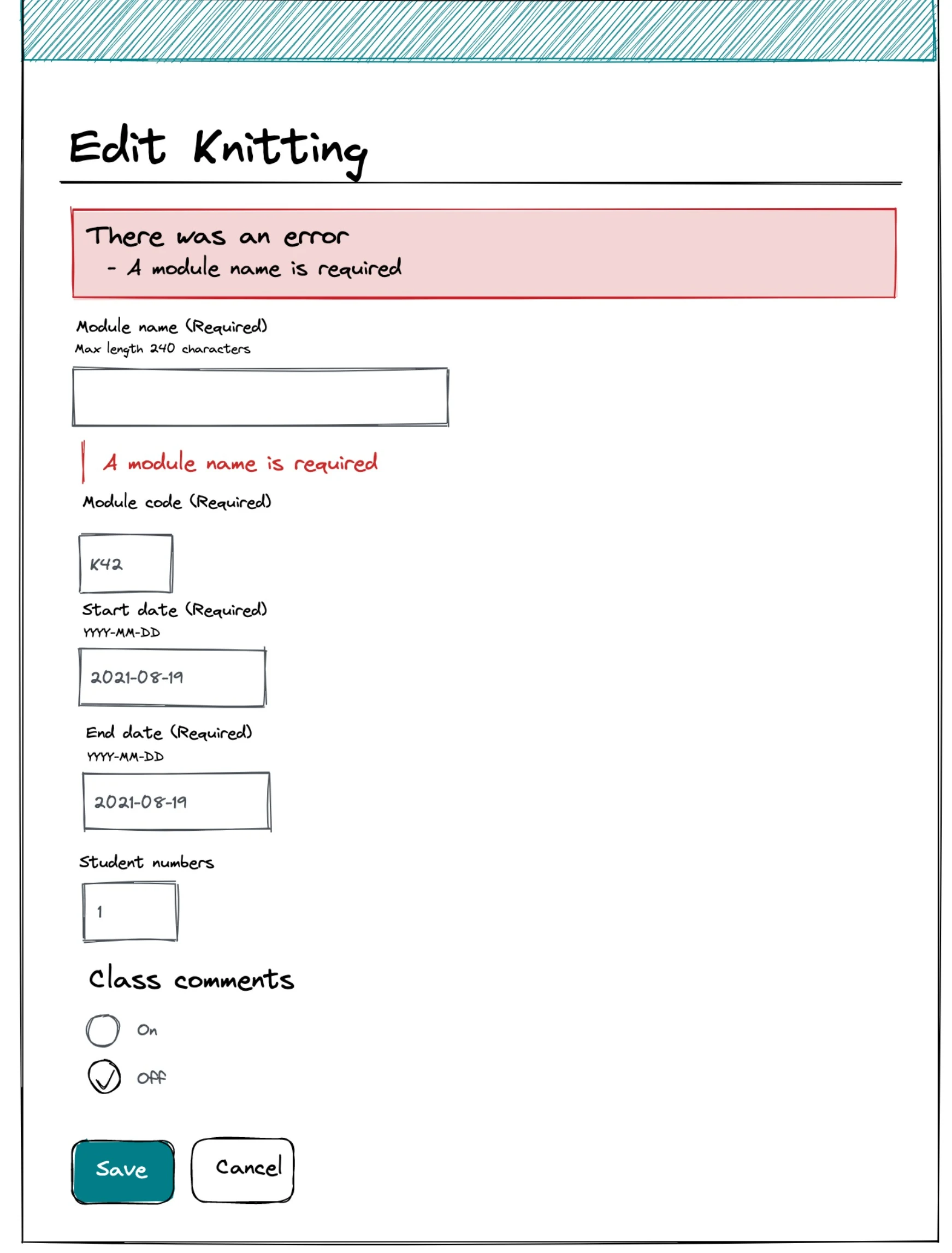
- I would reduce our reliance on modals and prefer URL addressable pages for common tasks.
- remove unused functionality in order to reduce the complexity of the application. This would offer a benefit not just for users, but developers too.
- implement oft-requested quality-of-life features
Design
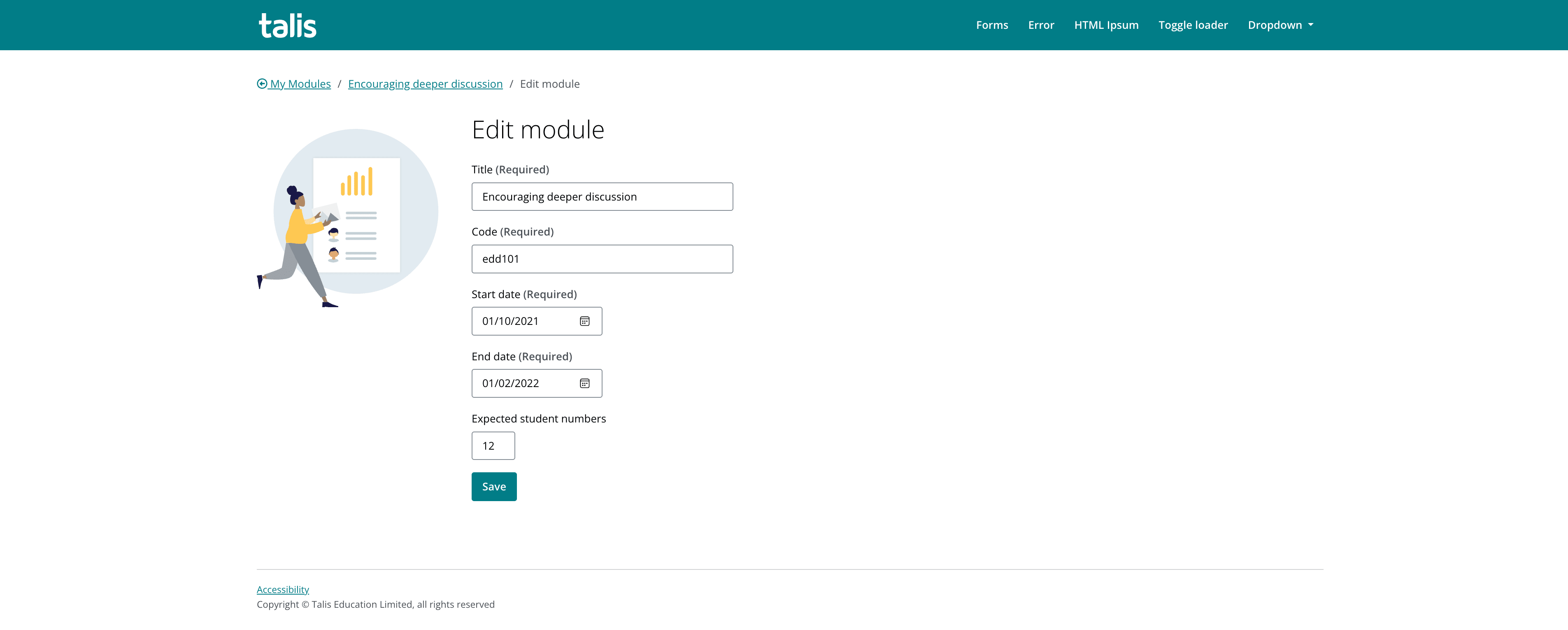
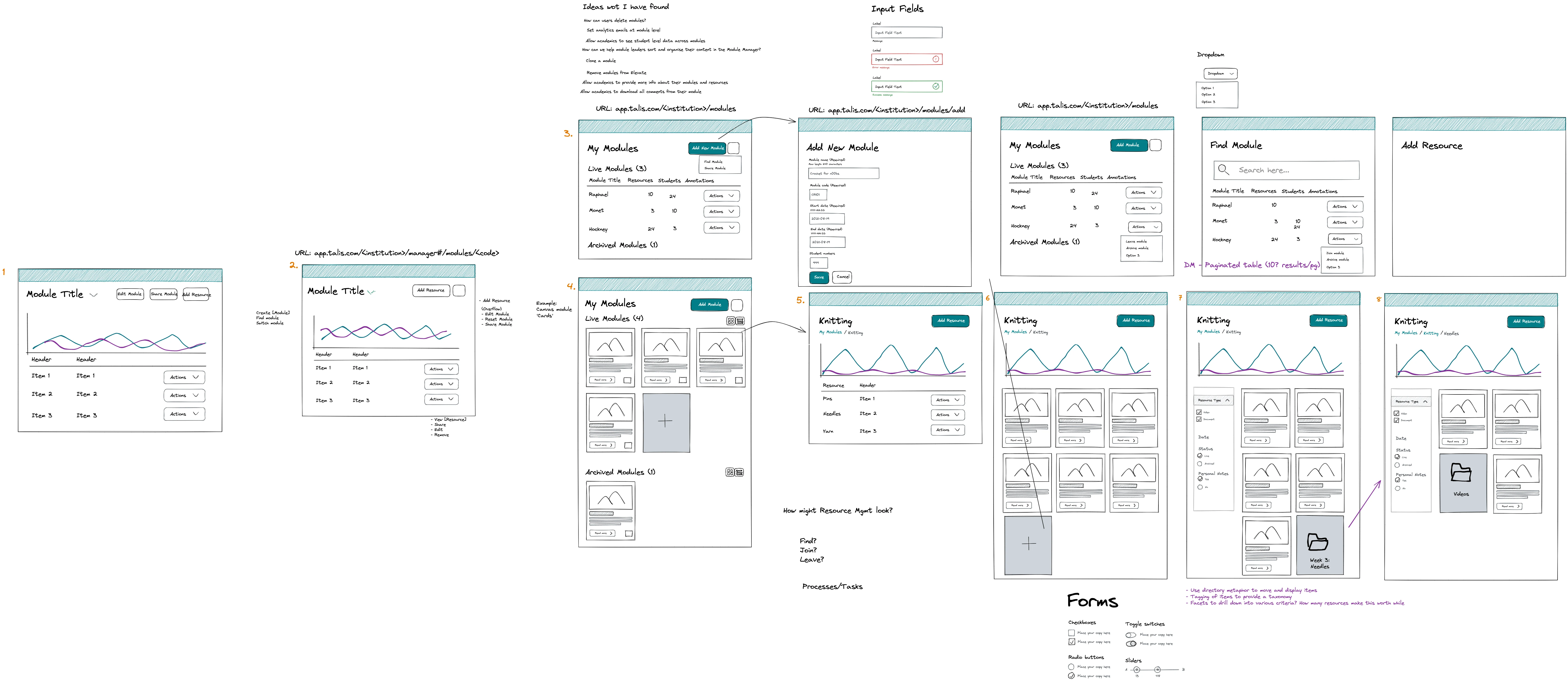
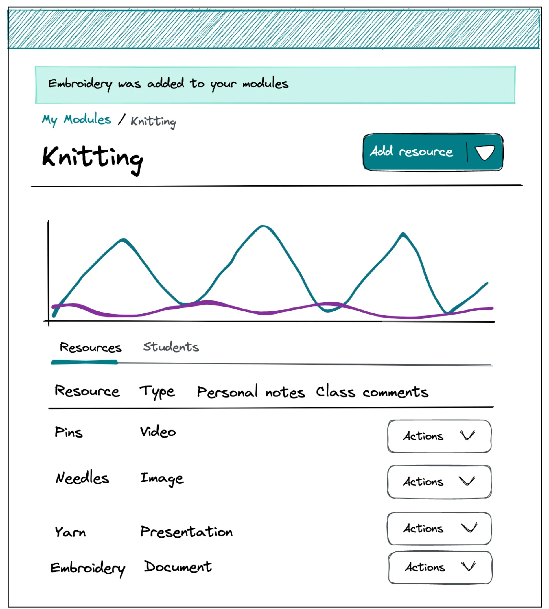
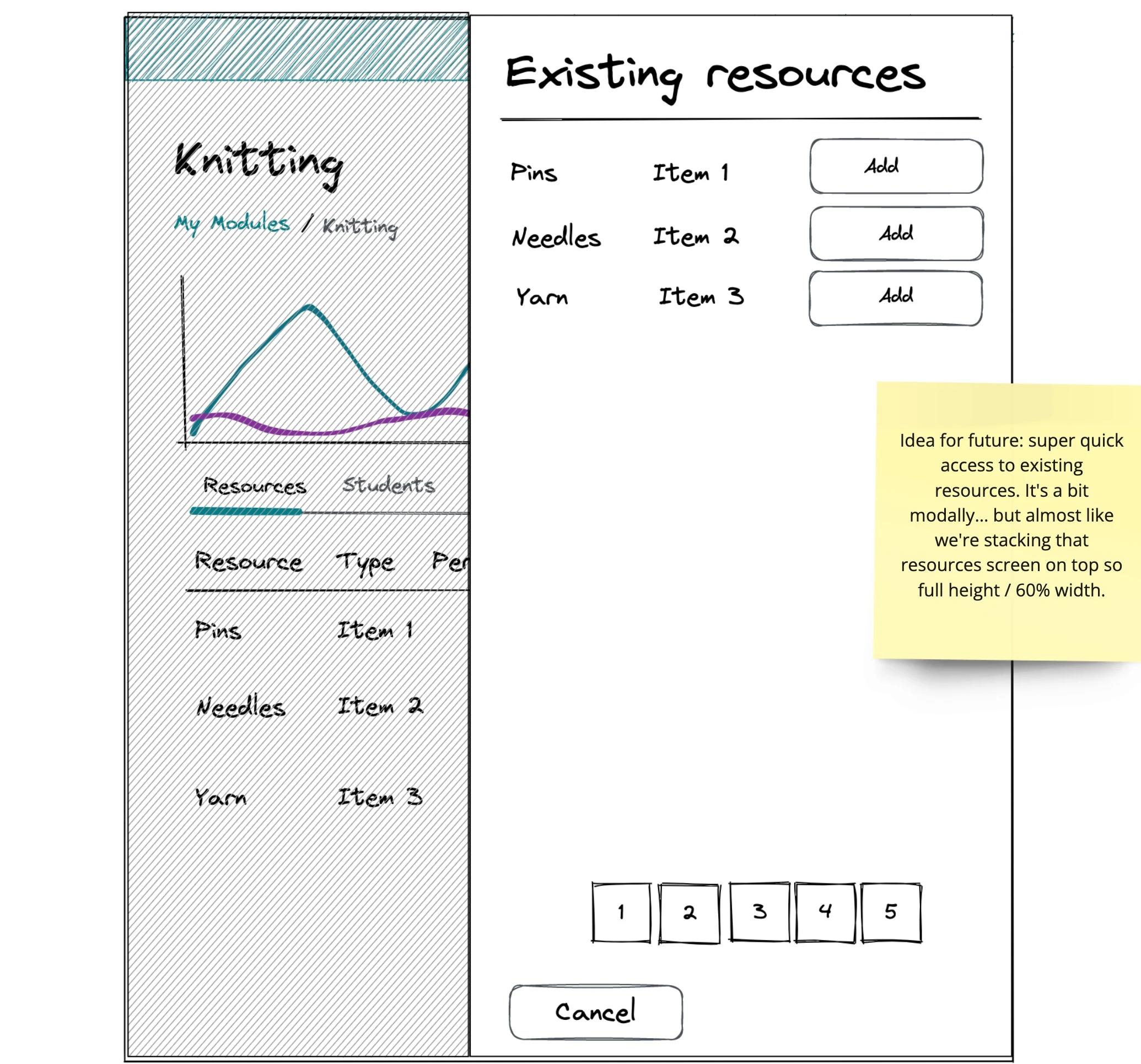
I used Excalidraw to wireframe each screen that would make up the Module Manager, and the user journeys between them.
Some of the key design decisions were:
- Incorporate breadcrumbs on each page to help the user orientate themselves
- Implement some of the search and filtering patterns we had implemented in our other applications
- Remove steps from processes to reduce the friction in completing tasks
- Give the application room to grow while using the existing structure: the old iteration crammed everything onto a single page, needing a number of overflow menus to contain all the features on offer.
While I was away on leave, my colleague, Ana, took my sketches and worked them up using our design system in Sketch in order to facilitate further discussion with the engineering team.
On my return, I created a HTML prototype using Eleventy in order to help sell the concept to my colleagues and hash out some of the proposed interactions.
Testing
As well as sharing the work internally, we contacted some of our most engaged customers and asked them if they’d like to take an early peek at the work. We were looking to launch this for the start of the 2022-2023 academic year, and needed our testers onboard before they departed for their summer holidays.
Some of the key findings were:
- Users appreciated the breadcrumbs!
- The UI was deemed ‘cleaner’
- But… it appeared we upset several users by relegating their most common tasks
The impact
While it’s true that you can’t please all of the people all of the time, I revisited the workflow that allowed users to archive their teaching modules. I’d originally opted to show these on the list of all modules, but given a different visual treatment. In the end, I moved these to their own page, which was now addressable by its own URL.
This revamped module manager rolled out to our academic users in time for the start of the 2022-23 academic year and has been well-received.