I led an initiative to discover, consolidate, and refine the many approaches to forms and form validation used across Talis products. I reduced errors, support tickets, technical and design debt.
The challenge
Talis is a software company that creates digital products for the higher education sector. Our products include a reading list solution (Aspire) for libraries, and a collaborative annotation tool (Elevate) designed for teaching and learning.
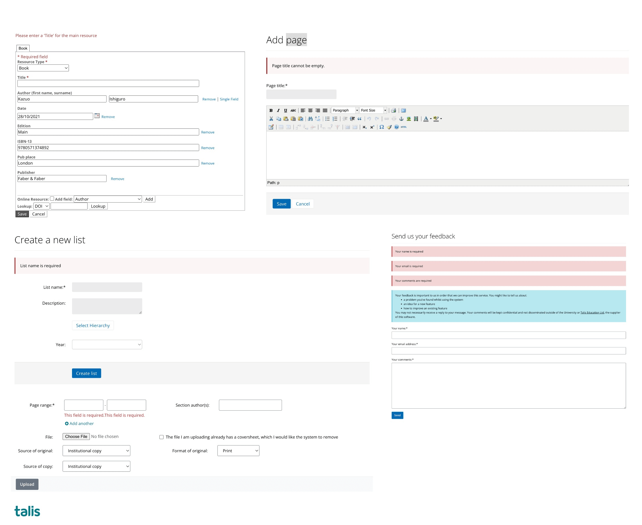
As befits a contemporary software-as-a-service (SaaS), both products feature a range of different forms to be completed by users. Having grown organically over more than a decade, Aspire and Elevate incorporated numerous combinations of visuals, interactions, and feedback mechanisms. One facet of good user experience is that functionality which purports to do the same thing looks and works the same throughout your time on the application. This is also beneficial from an accessibility perspective, particularly for those with cognitive disorders, where a predictable user interface makes it easier to use.
The goal for this project was to specify, design, and implement a cohesive and accessible form implementation across Talis products.
What I did
Research
To kick things off, I audited both applications and took screenshots of as many variations as I could find. I compiled them together on a Miro board, ready to group and categorise them.
At the start of the project, there were:
- horizontally-aligned forms
- vertically-aligned forms
- forms which perfomed server-side validation
- forms which performed client-side validation
- forms which validated on blur
- forms which validated on submit
- forms which featured inline error messages
- forms which only told the user “Error” in red text
…and so forth. If you can imagine it, it probably existed.
One would be hard-pressed to ignore the work the Government Digital Service (GDS) has done with regards the GOV.UK Design System. Adam Silver’s book Form Design Patterns covered the thinking behind that work, while another useful text is Web Form Design: Filling in the Blanks (2008), by Luke Wroblewski
During an earlier round of customer interviews, I had discovered that forms were a particular point of contention for many of them. Some of the key findings were:
- Users wanted a simple and fast way to add content without having to deal with errors or missing information: our most complex forms dealt with adding teaching resources
- Users valued feedback on the validity of their input as they typed or selected options from the form fields.
- Users wanted more guidance on how to correct their input errors or complete their missing information.
Design
Based on the research insights, I created user stories to define the main features and scenarios for the types of forms we used throughout our products. I used Excalidraw to sketch some low-fidelity wireframes to explore options visually. Once happy with the sketches, I used the prototyping kit I’d built with Eleventy to create a demo site where I could add interactions with JavaScript, before sharing with colleagues and testers.
Some of the key design decisions were:
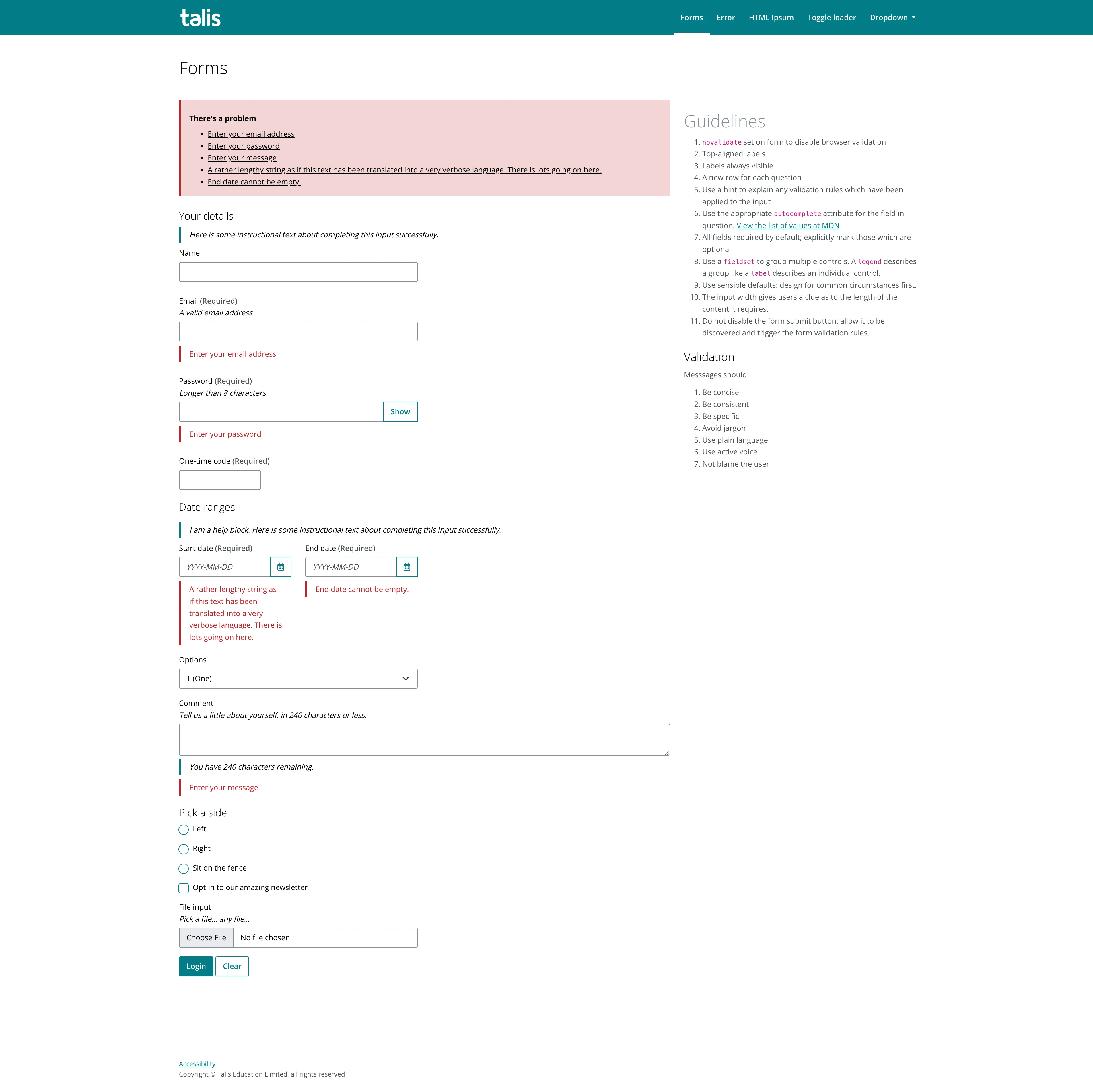
- Using vertically-aligned form fields, with the label positioned above, rather than to the side of the input.
- Using the text “Required” to each input, rather than relying on an asterisk.
- Adding inline help text – such as validation requirements – to each label.
- Using client-side validation on form submission
- Showing clear and consistent error messages and success messages for each form field that indicate what is wrong and how to fix it.
Testing
I conducted usability tests with five volunteers using the HTML prototype. I created a duplicate of one of our more complex forms, and asked them to complete the process of requesting a new resource digitisation – a common back-office library task when sourcing content for course reading lists.
Some of the key findings were:
- Users liked the clear and consistent error messages, but wanted the inline messages to disappear once the mistake had been rectified.
- Users found that the vertical form layout was easier to scan, particularly when using a device with a smaller screen.
- The inline help messages were deemed particularly useful for helping to remember the required format for dates.
The impact
Based on the testing results, I made some iterations on the form validation technique, updating the client-side code to remove the inline error message from a previously ‘dirty’ and invalid input when it lost focus.
I shared this proposal along with my research findings and testing feedback with my UX colleagues, as well as the Tech and Product members of the product trio. I received positive responses and the nod to begin rolling these guidelines out to production. I made sure to document design and development guidelines, and created a number of Sketch components for others to use.
At the time of writing, our ‘modern’ applications are using this approach to forms. We’ve seen a decrease in tickets relating to form validation, and from our product stats, we see that users are encountering fewer validation issues. I’m looking forward to seeing it rolled out to locations which receive the most traffic – our resource bookmark screen and the accompanying browser extension.